关于我们ABOUT US |

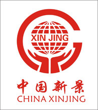
Xinjing's corporate identity is represented by red, which represents enthusiasm, progress, and struggle. The text adopts a calligraphy body, which seems to have vitality, appeal and affinity, and is in line with the internationalization of the logo. It integrates classical and modern, traditional and fashionable. Xinjing's corporate logo has a simple, smooth and dynamic overall shape. The interior of the trademark is a combination of the new pinyin “XINJING” and the earth. It expresses the determination of the new King to push the new King brand to the international market. With its open hands lightly holding the earth, it symbolizes the need to deliver the products and services of the new scene to every corner of the world and convey the confidence and enthusiasm of the people of the new scene. The outside of the trademark is a semicircle like the English alphabet “G”. It stands for “Globalization (Globalization),” and “Cooperate (Cooperation, Collaboration)”. In addition to implying that the New King brand is in line with the international market, it also contains The spirit of the company's internal unity, comprehensive innovation, truth-seekingness and pragmatism, and continuous transcendence demonstrates the company's good vision of advancing with the times, making progress, flourishing development, and striving to create a better life. The concept of new scenery - Do what others don't want to do, do it better than others and do better than others! - Adhere to a 1% improvement every day and self-review. - There is no failure in the world, only a temporary halt to success. - Failure is not the mother of success. Review is the mother of success. Company vision: 1. Become one of the top ten ceiling brands in the world 2. As long as the customer wants to buy a ceiling, he thinks of a new scene |

